Chasing the Hidden Stories in Formula 1
A cream-colored redesign, a fight with Gmail's CSS, and everything else it took to get Telogify built, in order.
The best analogy I've heard for Formula 1 is that it's a global science fair. Eleven teams, one season, all trying to out-engineer one another. I've always loved that about it, especially how much of the sport lives in the numbers. Some of the best stories in a race weekend are sitting in that data, so I built Telogify to go get them.

June 29, 2026: everything shipped, wrong
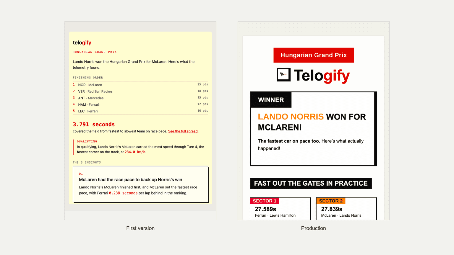
This is when I had a "first version": the degradation math, the LangGraph agent, insight generation, the API, a first frontend, even a first version of the email digest. It passed the eyeball test.
Looking closer, almost everything was wrong.
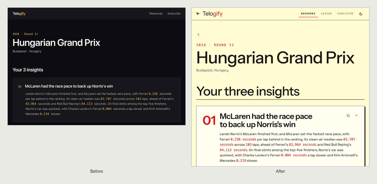
Acceleration numbers cited in raw m/s², a unit nobody skimming a headline could parse, a midfield car compared to the race leader like that was never a fair fight. The frontend looked the part too, dark background, a single amber accent, panels blurred like frosted glass, the same look as every other dashboard.
July 1–2, 2026: from dark glass to cream paper
Two days later, I rewrote the whole design. I really tried to lean into an editorial brutalist look. Cream background, near-black ink, one hot F1 red, hard two-pixel borders, and a shadow that doesn't blur. It just sits offset behind the card like a printed page. I also added a faint paper-grain texture at low opacity, just to kill the flat "digital sterility" most dashboards default to. The idea was always to feel like an F1 newspaper.
July 4–5, 2026: teaching the model not to invent things
An insight is supposed to work like a caption under a photo: it should tell you what happened without making you do the math yourself. The harder problem was never the charts, it was getting an LLM to write those captions without inventing anything underneath them.
I chose a LangGraph agent over a simpler prompt chain because the task demanded it. A weekend needs data pulled from several independent sources, the grid, gaps, tyres, telemetry, and which one to call next depends on what the last one returned, something a fixed template can't branch on. Binding real tool calls also forced retrieval over recall, which is what let me actually enforce the never-invent-a-number rule instead of just hoping the prompt held. A ReAct loop could also notice when a tool call came back short and try a different one instead of committing to a single shot.
My real method for steering that writing was manual: I sat down and audited upwards of 30 insights by hand across the first ten races of the 2026 season, reading each one the way an actual fan would. I used that pass to put my own fingerprint on how the insights get written. The early guardrails came out of that same read-through: invented retirement causes, "front row" claims for cars nowhere near the front row, a car declared faster than the winner when the data said otherwise. One fix pulled a lap-count field out of the tools entirely, since it runs short of the real retirement lap and no amount of prompting fixed that reliably. Faster to remove the footgun than train around it.
July 2–9, 2026: getting the methodology right, with help
I've followed Mirco Bartolozzi's fdataanalysis for a long time, and reaching out to him is actually what pushed me to start building race-to-race insights in the first place. Once I had a working draft, he walked me through three real methodology questions. How to isolate a car's true pace from traffic: gap-to-car-ahead, with 0.5 seconds as the threshold for a lap to count as traffic-compromised. How to separate fuel burn from tyre degradation and track evolution in lap time: each kilogram of fuel costs 0.025 seconds a lap, and track evolution gets lumped in with tyre deg since it's a secondary factor through a race. How to read ERS deployment against a raw power deficit: no hard cutoffs, just comparing a car's full-throttle acceleration at a given speed against itself elsewhere on the same track at similar speeds. All three went straight into the codebase.
July 12, 2026: fixing mobile
Mobile bugs hide from simulators. They can't hide from your own thumb on your own screen.
Roughly 24 commits, about 15 distinct bugs, found by opening the site on an actual phone over the LAN and questioning everything. Sticky tooltips that wouldn't close on touch, charts needing a horizontal scroll hint, a box-plot popup that genuinely corrupted itself on real iOS Safari, something no simulator would have caught.
I also decided two dense telemetry charts, the qualifying scrub visualization and the season deployment scatter, just don't survive a phone-width squeeze. Rather than hide them, I built visible desktop-only panels that say so directly, keeping the underlying verdicts available on mobile even when the chart isn't.
July 17, 2026: the insight overhaul, and email work finally starts
That audit is where the real turning point came, in insights citing unreadable units, repeated numbers, and comparisons to the wrong car. I rewrote the entire deployment vocabulary and added a rule comparing each team to the rival directly ahead of it instead of the outright leader. I also added a deterministic backstop rejecting any header containing a raw statistic, since prompt instructions alone didn't reliably hold.
Two days later, a correctly generated insight got permanently rejected by a validation bug that misread a hyphen in "150-250 km/h" as a negative sign. That bug had been sitting there the whole project, never exercised until the writing finally got good enough to trip it.
Around this stretch, the email digest finally got real design attention for the first time since that first version back on June 29. It got redesigned to match the site's own cream-and-red system instead of sitting off on its own.
July 29, 2026: redesigning the season ranking
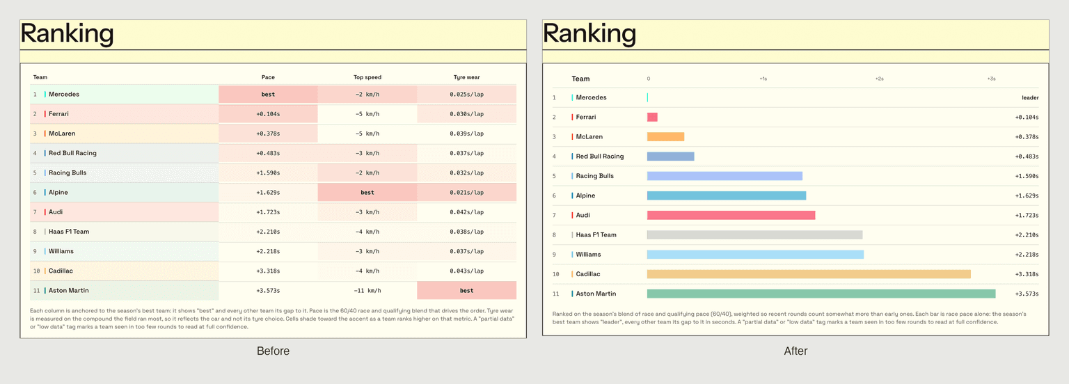
The original season ranking table used color opacity to encode rank, and with eleven teams on the grid it just read as a wall of pink. It also tracked tyre wear and top speed alongside pace, but using the platform myself, I kept finding I only ever looked at the pace deltas. That's what led me to consolidate the ranking down to pace alone, dropping the other two metrics rather than keep them cluttering a screen nobody was reading. I switched the surviving pace column to a proportional bar showing the actual gap in seconds.
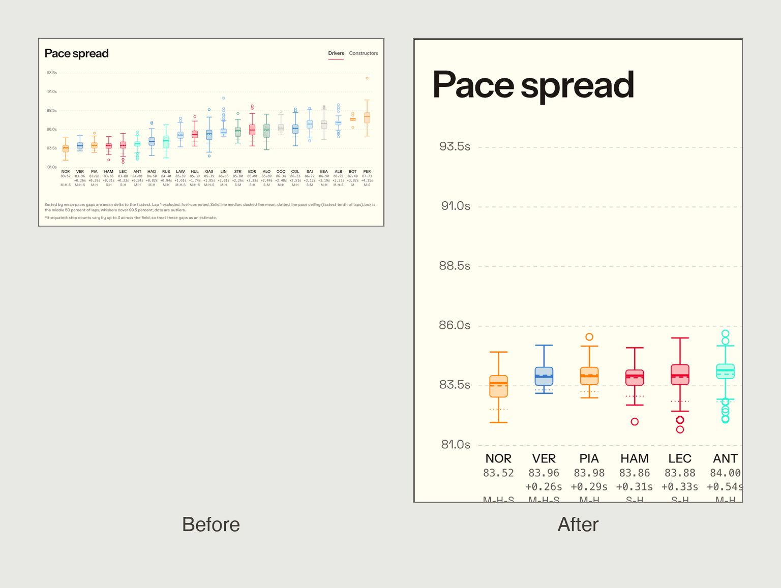
Separately, I changed the ranking math itself. The inciting incident was Hungary: Aston Martin brought an upgrade package strong enough to contend with and leapfrog Cadillac. The ranking still showed them seconds behind, technically correct on the season average, misleading in the moment. Every round was counted equally, so current form got diluted by results from six races back. Now it's an exponentially decayed average with a six-round half-life. The pace spread chart next to it got the same kind of pass around this stretch, cleaner spacing, a Drivers/Constructors toggle, an axis that's actually readable instead of a wall of overlapping labels.
August 1–3, 2026: measuring what Gmail actually does
I thought email would be the easiest stint of the project. Iterate on an HTML design until I liked it, send it through Gmail, done. That was a massive oversight.
Seventy design versions later, I understood why: Gmail doesn't just render your HTML, it quietly rewrites parts of it first and dares you to notice. I built a measurement harness called emailsim because I'd stopped trusting anything I assumed Gmail supported. A rotation effect looked fine in every preview; a real send measured it landing at exactly zero degrees, not rotated at all. A drop shadow got stripped the same way, so I rebuilt it as two nested boxes, a fake shadow Gmail can't strip because it isn't a shadow. A negative margin left a visible gap that my own tool reported as zero pixels wide. The real bug was architectural, not a bad value. Fixed by restructuring the layout instead.
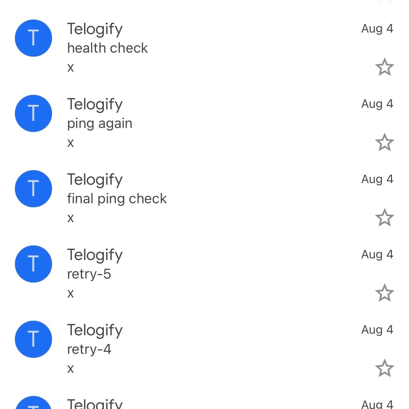
Somewhere in the middle of all this my inbox stopped looking like a person's inbox. "retry-3." "retry-4." "retry-5." "final ping check." "ping again." All from Telogify, all from me, most of them a few minutes apart.
August 4, 2026: the database almost lied to me
I added row-level security to the subscriber table and felt good about it until a test caught something I hadn't considered. Postgres superusers bypass row security unconditionally, and both my local database and Railway's managed Postgres hand out superuser by default. The policy was decorative. Fixed with a restricted, no-login role the request path drops into explicitly, plus an append-only trigger enforced at the schema level, so no code path can silently opt out of it. I also caught an unset secret key that meant unsubscribe tokens were signed with an empty string, no secret at all: anyone could have unsubscribed a stranger.
August 6, 2026: dark mode and the ghost preheader
Dark mode was its own genre of pain. Gmail auto-rewrites CSS colors for dark mode and flipped my masthead logo into a white-bordered black box without asking. Fixed by baking the logo into a flat hosted image, immune to the rewrite, then doing the same for every team-color swatch. The inbox preview line also read "Telogify WON FOR MCLAREN!" because Gmail scanned the first visible text in the body, a live result span. A hidden preheader block, sitting first in the body where no one ever sees it, fixed that too.
What it added up to
I built Telogify because I wanted the hidden stories in F1 to be as rigorous as they are interesting. Never invent a number was the rule that started this project, and by the end it described how I built the thing too. Every fix above came from something measured, audited, or broken in production, not from a plan that survived contact with reality.